New characters are online | Xu Jing: pen and ink
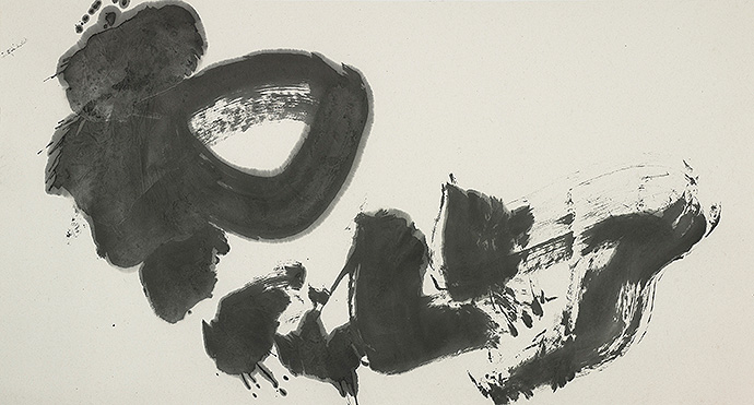
Calligraphy is like a shadow to her.
‘The real joy of calligraphy is to write freely so that your life and spirit are not lonely.’
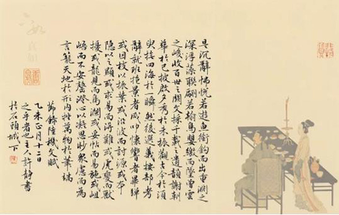
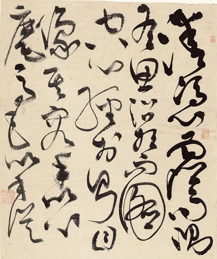
She is a ‘chivalrous girl’ in the calligraphy world. Her journey with calligraphy began at the age of five. In over three decades of practice, Xu Jing has achieved a classic, divine and rich ‘neoclassical paradigm’. While absorbing different paradigms, she has re-established calligraphy as a Chinese classic in modern interpretation.
Xu Jing
Signing Calligrapher for Hanyi Font
Full-time Calligrapher, Nanjing Calligraphy and Painting Institute
Xu Jing’s background in graphic design gives her an upper hand in calligraphy writing. Her innate sense of space and familiarity with design combinations of characters lead her emotions and explosive power of skills to a distinct rendition in her modern calligraphic works.
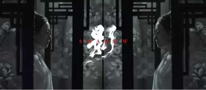
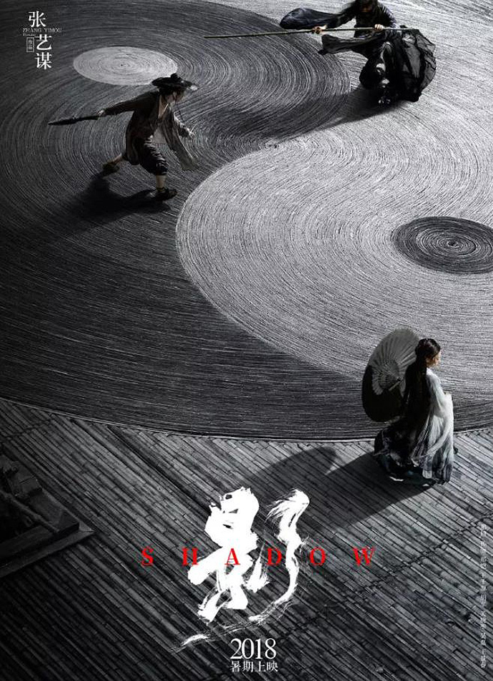
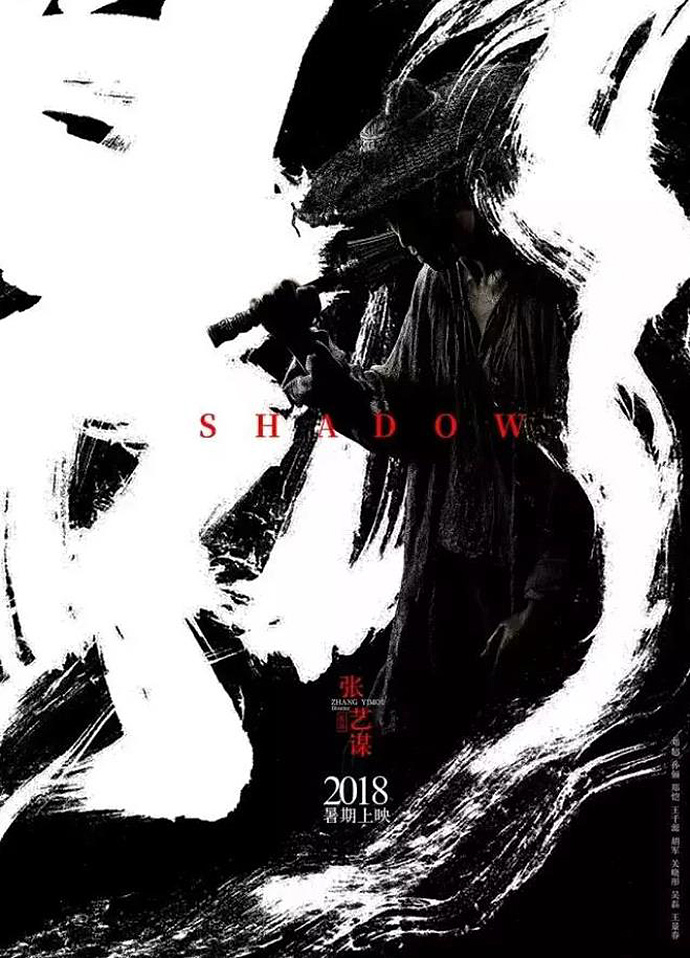
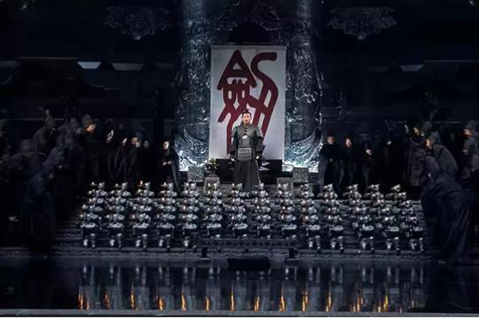
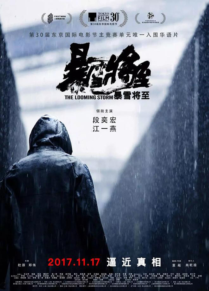
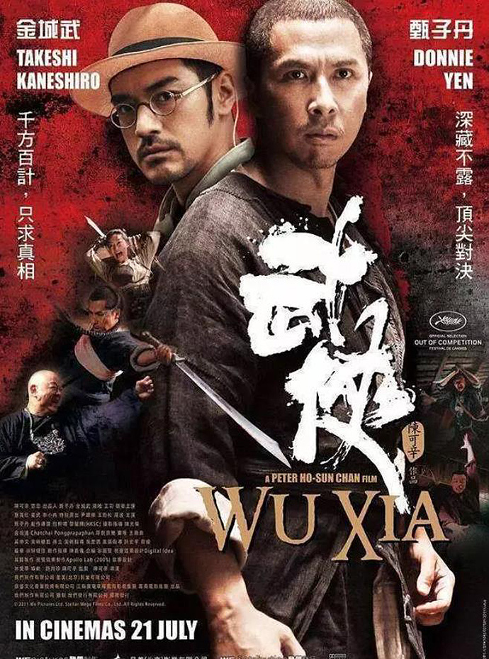
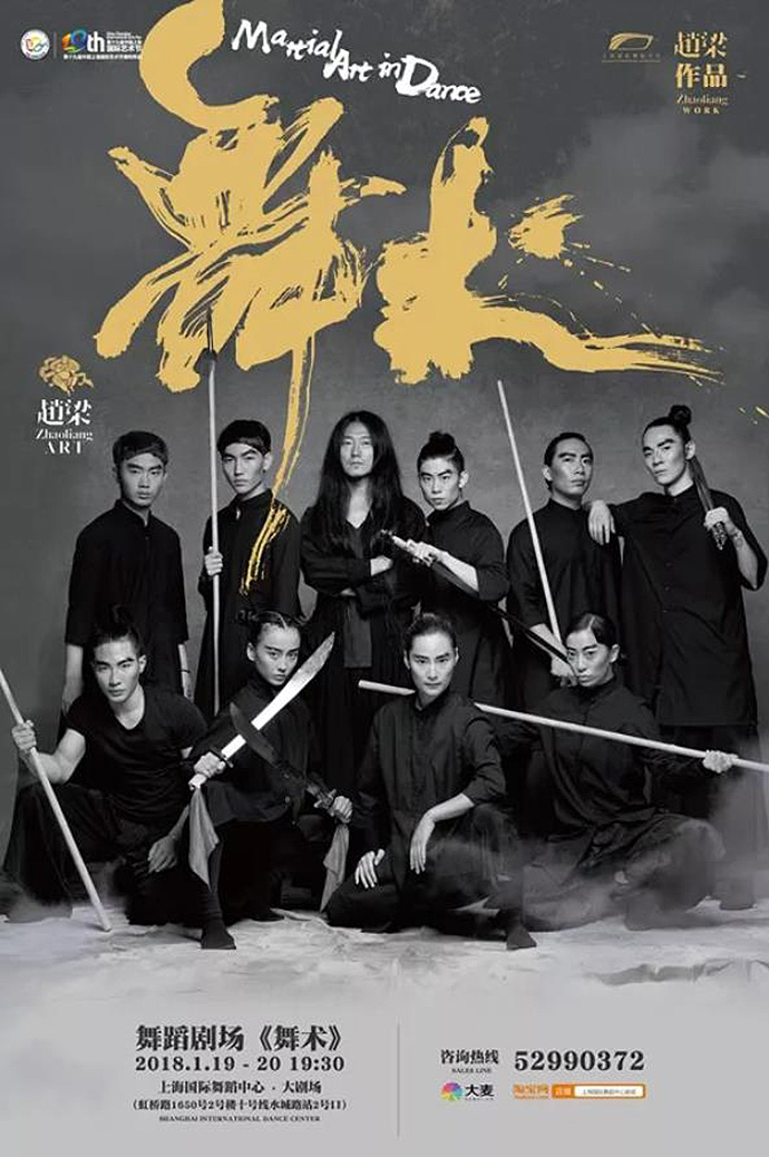
Xu Jing believes that calligraphy plays an important role in a contemporary society. Her cross-field collaborations with well-known contemporary artists, filmmakers and performing artists are constantly pushing the boundaries of a once classic art form.
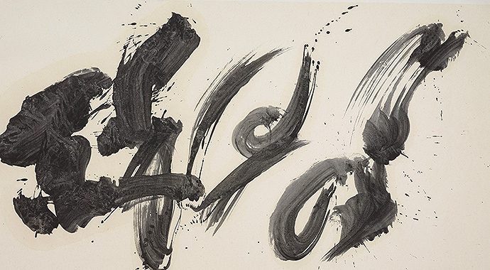
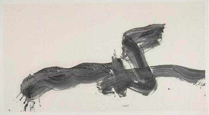
Xu Jing’s works focus on an understanding and expression of the depth of human emotions. By grasping the overall rhythm, each work’s origin and its urgency, she heightens the emotions in question by providing context. She channels her creative intent from the origins of the text to a formal calligraphic structure, as if breaking its complexity to a more natural, digestive state.
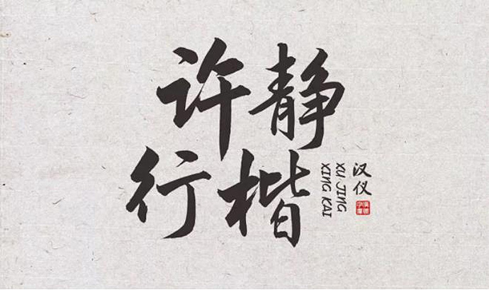
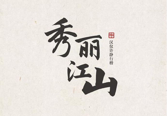
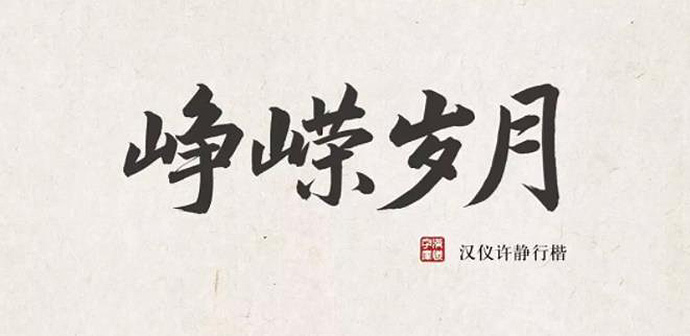
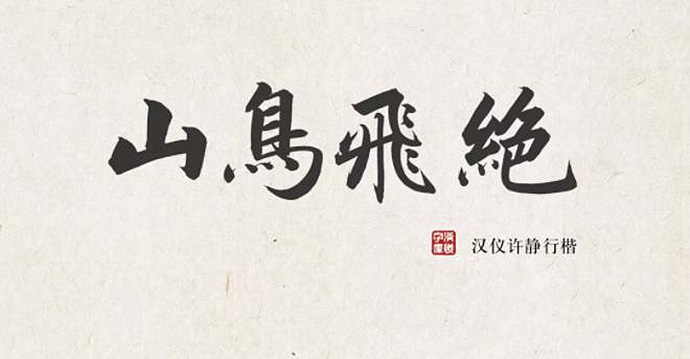
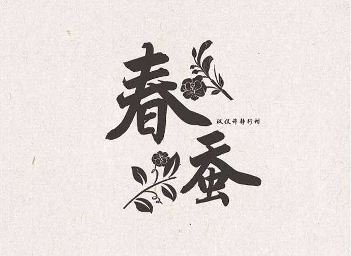
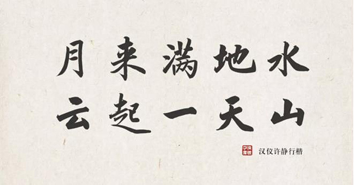
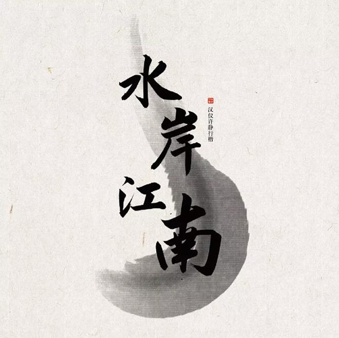
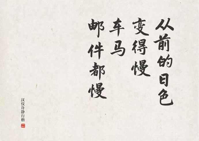
Han Yi Xu Jing Xing Kai
9169 Chinese Simplified and Traditional + Latin Characters
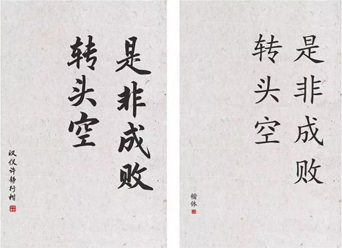
Han Yi Xu Jing Xing Kai is a Han Kai font that is a by-product of a collaboration between Han Jing and Xu Jing. This type of font of character writing has both the beautiful arcs of running script and the structure of regular script. It is representative of oriental charm.

Xing Kai is a font between regular script and running script. It is freer than a regular script and more formal than running script. Its fluent strokes and proper turning encompass the personal characteristics of two artists, making Han Yi Xu Jing Xing Kai a unique font.
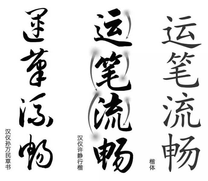
Han Yi Xu Jing’s contrast of strokes in the typeface is clear. It delivers a strong sense of power and makes large characters more pronounced.
This font of character writing accelerates the writing rhythm of regular script in a continuous manner, making the writing of the characters complete with flexibility by subtly reflecting the dynamic movement of a pen on paper.

The flexibility of the character strokes allows for adjustment in the consecutive sequence of strokes. The entire writing process, from its beginning to its end, is grounded. For example, a radical ‘氵’ has left-to-right structure as well as form.

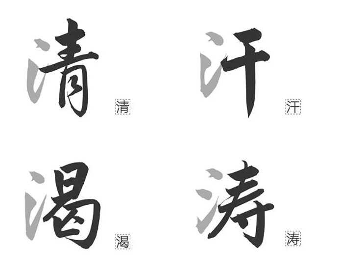
Han Yi Xu Jing Xing Kai’s regular Western script incorporates the writing style of calligraphy, making it easy to use. The fluidity of strokes and smooth turnings provide a much-needed flexibility in changing lines.
When writing in Western languages, as well as in Chinese, we tend to lean to the upper right. This intrinsic harmony brings Western and Chinese writing practices closer together.